LOS ANGELES — The J. Paul Getty Trust introduced a new brand identity that captures the breadth and complexity of its work and defines and symbolizes what makes it unlike any other arts institution in the world.
“This new design reflects Getty’s personality and where we are headed,” said Katherine E. Fleming, president and CEO of the J. Paul Getty Trust. “It gives visual form to a more connected, outward-looking Getty, one that is investing in ambitious ideas, supporting visionary work across the arts and expanding access to art and knowledge around the world. This identity helps us tell a more unified story about who we are and the impact we hope to have.”
The institution set out to create a visual identity that could represent the many interconnected parts of Getty, one that captured the global scope of its mission and brought a sense of movement, energy and life to the art, research, conservation and philanthropy at its core. To bring that vision to life, Getty partnered with Fred & Farid New York, known for their radical design approach to global cultural and lifestyle brands.
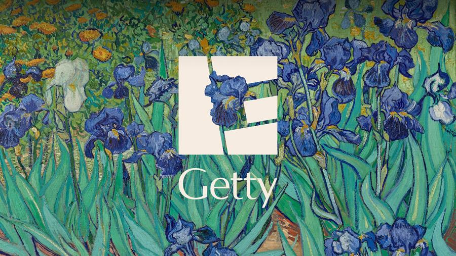
The result is a new “G,” a visual accompaniment to the most recent Getty logo that reflects the many elements that make Getty unique within the cultural landscape. The “G” forms a square block inspired by the travertine blocks of the Getty Center, while its four mosaic-like pieces, drawn from artworks at the Getty Villa, also represent Getty’s four core programs — the Museum, Foundation, Conservation Institute and Research Institute.
“Getty’s range of programs and offerings shaped the strategic foundation for the rebrand,” said Farid Mokart, creative chairman at Fred & Farid New York. “Working across the institution, we defined together a single, enduring ambition rooted in Getty’s founding purpose: expanding access to art and cultural heritage worldwide. This ambition anchors the new brand identity and is expressed through the tagline ‘ALL FOR ART.’”
Additionally, the flexibility of the “G” allows a wide range of imagery — from collection objects to archival materials, architectural details and contemporary visuals — to become a part of the design. The “G” can be blown up, rearranged and reinterpreted, unlocking endless iterations that reflect the open access to art that Getty offers its audiences.
“We needed a visual identity that was uniquely Getty and distinct enough to unify how we show up globally,” said Yasmine Vatere, assistant director of brand management and marketing for Getty. “Working with Fred & Farid New York, we iterated relentlessly, moving from concept to real-world use cases early and refining until every element, including the tagline, could scale across the institution consistently. This system gives Getty one clear, ownable expression in support of the work we do around the world.”
![]()
At its core, the fluid and evolving “G” embodies Getty’s next chapter, one that includes ambitious leadership and forward-looking vision. It also reflects Getty’s commitment to making art accessible to all through free admission, free programs, free digital research and resources, and global philanthropy.
“Every day, we engage new audiences across platforms worldwide, building a shared community around Getty’s collection and global work while staying grounded in our Los Angeles roots,” said Desiree Zenowich, senior director of communications for Getty. “From its beginnings as a seaside museum to an international cultural institution with extraordinary reach, Getty has evolved in profound ways. This identity gives us a more authentic way to reflect who we are and how we connect with people today.”
Discover more from Adpulp
Subscribe to get the latest posts sent to your email.